Analyzing data about Nepal and writing about them, I have made some interesting discoveries.
As anyone working with data is aware, to begin with, the absence of data reveals and/or hides a great deal. With the data that’s available, the actual values or magnitude of the values as well as the relative values also reveal and/or hide relationships or information etc. Then, of course, the trend or pattern or lack thereof in a data set also do the same.
The other thing with data is that if you track or study them by manipulating them mathematically–very simply or in complex ways–and/or by creating graphs and charts etc., they might also reveal that which just tables of the raw data might not or don’t.
While I was born in Nepal and as a child grew up in the country, living and working here of the last decade after spending most of the preceding twenty-five years abroad, I have discovered and learned a great deal–through data–about the society, the culture, and the people, many of which I had NOT known or been aware of. Many of them totally unexpected–some even strange. One recent peculiar accidental discovery comes from the 2011 National Census Data. (See Additional Reading below for other discoveries.)
But before that, a little bit about population distribution using census data for the United Kingdom.
The line graph below show the frequency of single age male population of the UK in 2011 and that of Barnet, a suburb of London. The two were chosen because of the large difference between them.

Nothing unusual about either. As a matter of fact, a population pyramid for the United Kingdom reaffirms that.

Were a population pyramid created for the population of Barnet, it would NOT be significantly different. The number of bulges would have been different and they would have appeared in slightly different locations on either side. The curved edges would have been as smooth as in the one above.
To be sure, the population distributions in other parts of the UK are not unusually or significantly different from the above two as you should be able to conclude from the line graphs below.

Population data being what they are and digits being what they are, of course, one or another digit should not significantly dominate as the last digit in the ages of the population. One would not expect the distribution of even and odd digits at the end of numbers representing ages to be heavily skewed towards one or the other either.
That is so when it comes to the last digits in the ages of the UK population as you can see from the histogram below. It shows the frequency of the digit as the last digit in the ages of the population. Chart 1 shows the raw numbers, and chart 2 the relative frequency.


There is a pattern however: the frequency decreases going from 0 to 9. That is, the smaller digits appear more often than the bigger ones. 1, therefore, is the most and 9 the least common. The biggest difference between any two digits is less than only two percentage points however.
(What’s the explanation? I don’t know. That is NOT to say that there might NOT be any; just that I don’t know about it. What I do know about is Benford’s Law. However, the law is about the frequencies of 1-9 as the first–and NOT the last–digit in a very large set of randomly generated numbers consisting of a huge range, typically spanning several orders of magnitude. The law says relative frequencies of digits 1-9 as the leading one decreases. That is, 1 is the most and 9 the least frequent leading digit–~30% and ~5% respectively–in such a data set.)
Looking at groups, the frequency of odd and even digits, what I found was, again, what I expected: they are pretty much equal. The difference is insignificant. After all, from 0 to 9, there are equal number of odd and even digits and, therefore, their distribution should be no different from the distribution of heads and tails from flipping a coin thousands of times.
Here are the results anyway.


Curious minds will likely stop here and ask, “Why the slightly higher frequencies of the even digits?” anyway. And that would be an excellent question. For the answer, first, go back to the last digit frequency charts, and, second, analyze the digits which make up the even and odd groups. What do you notice? (Go to the bottom of the blog for the answer after you have attempted it! 🙂 )
Now finally, to return to the strange discovery….
Not long ago, working on yet another subset of population data in the 2011 Census Report for Nepal, something (what I don’t recall) prompted me to plot a line graph of age vs. frequency. The chart was really strange: it had two sets of peaks and a pattern to both too. Following its creation, I tweeted it, asking if the reason, the explanation, was something cultural.
Two interesting patterns in the population of #Nepal as per the 2011 #CensusReport. What do you think is/was going on? What’s the explanation? Something cultural?
— Dorje Gurung, ScD (h.c.) (@Dorje_sDooing) February 19, 2023
(2021 Census Data has NOT yet been made public!) pic.twitter.com/Tewo2o7i5x
Really intrigued, I had a look at the 2001 Census Data and discovered the pattern there too! I tweeted that as well including a commentary on birthdates and fluidity of age.
Patterns also found in d 2001 data! In d above tweet, I asked if d explanation lies in something cultural.
— Dorje Gurung, ScD (h.c.) (@Dorje_sDooing) February 20, 2023
I suspect so. MOST in #Nepal don’t keep a close tab on birthdates (& therefore age is fluid) & hence the tendency to round off!
What do you think? #Census #PopulationData pic.twitter.com/ZcSfgRYGs2
My curiosity peaked some more, I went ahead and analyzed the data further by looking at the frequency of digits. Sure enough, there was an interesting pattern! What I discovered, I tweeted again!
So, according to d ages reported to d census data collectors in 2009-10 by Nepalis (& if you end up playing an age-guessing game!), in case you didn’t know, d MOST prevalent digit in d ages of Nepalis is 0, followed by 5, then 2 & finally 8.
— Dorje Gurung, ScD (h.c.) (@Dorje_sDooing) February 20, 2023
The least? 9! 🤣🤣#Nepal #AgeOfNepali pic.twitter.com/QkQPbbkcG8
Wondering if that was just an anomaly the last two times ages were reported to the census data collectors by the head of the household or recorded by the data collectors themselves, or something that truly reflected some cultural practice or some mentality, I went even farther back…to 1961. Except, I just wasn’t able to find population data broken down by single year age. The closest was the same for 1% representative sample of the population. So I went ahead and analyzed that data set. I found the pattern there too!
Here are the results of that and additional analyses.


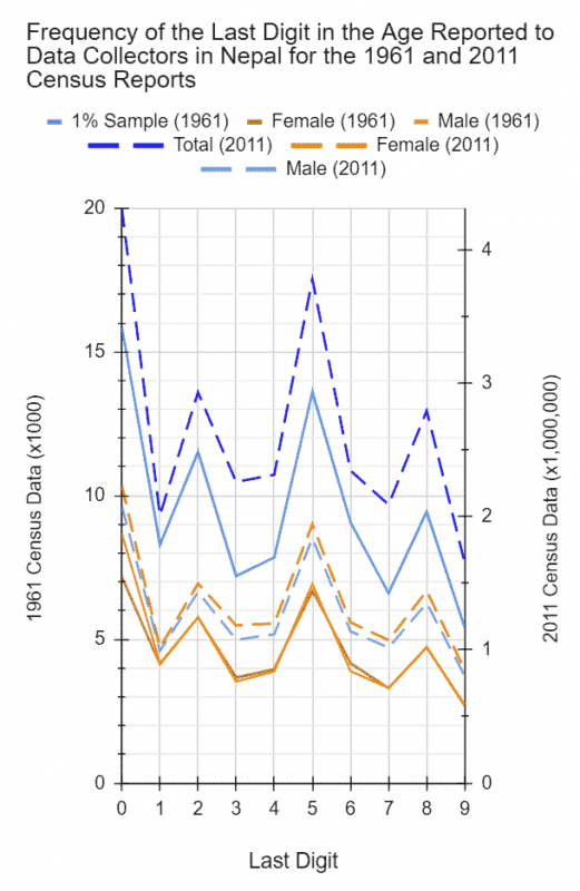

The difference between the most (1) and the least frequent digit (9) is a significant 10%! What’s more, 1 is proportionally almost three-times more frequent than 9! And not surprisingly, the frequencies of even and odd digits are also significantly different (see histogram below).

The difference is between 10 and 13 %. Can you mathematically account for the difference this time? (Again, go to the bottom of the blog for the answer after you have attempted it!)
So it appears that Nepalis have a cultural bias towards certain digits more than others when reporting and/or recording one’s age, the most towards zero followed by five.
Why? Where does it come from? Who knows.
And are Nepalis even aware that they do this? If so how many or what percent? I wonder.
A dear friend did draw my attention to the fact that numbers have symbolic significance for Hindus. Zero for example holds some significance. And, depending on what they are talking about, or depending on the context, even or odd numbers hold significance. But apart from that, I was not able to find any concrete source detailing the reasons.
Regardless, while with this practice I haven’t been able to decide if there are any detrimental ramifications or consequences, there’s surely many practices and behaviors also driven by unconscious biases which aren’t so innocuous. Sufficient Nepalis, for instances, display unconscious or internalized casteism in their beliefs, attitudes, practices, and behaviors which have had devastating consequences for the society. Many, not surprisingly, struggle to recognize they suffer from unconscious bias or prejudices when it comes to what we believe about people from other castes or the way we engage with–or treat–people belonging to other castes etc. Worse, many explain it away as “culture” or “tradition.” The caste system has corrupted pretty much every Nepali mind but many can’t even enumerate some of the ways it has, forget about be able to estimate the extent to which it has.
So, let me leave you with two more important questions whose answer you won’t find at the bottom 😀 because I myself don’t know. As humans we all suffer from cognitive biases. Not surprisingly, Nepalis ALSO appear to have some peculiar biases as demonstrated by the age distribution data. What other such peculiar unconscious and internalized biases do Nepalis hold? What do you think have been the consequences of that to the society, if any?
Additional Reading
Links to a few blog posts about unexpected, eye-opening, fortuitous, strange discoveries I have made about Nepal from data and/or data analysis.
- Until I converted the marital status data found in the 2011 Census Report into pie charts I had NO idea that more than a third (36%) of Nepal’s age nine and older population were unmarried and almost 3 in 4 (74%) married females had been married (off) before they turned 20!
- Until I converted the education level data into histograms, I had no idea that the level of education of the population of Nepal was so abysmally low–much less than 10% have 12 or more years of education!
- Another time I was creating charts and graphs, I discovered that the Government of Nepal hid a lot of information about the population of the country before 1952-54 and even during the rule of the Shah autocrats, notably about the ethnic/caste composition of the population.
- Tracking COVID-19 data for Nepal and also related data, a chart alerted me to the fact that the country was reporting on antigen-positive cases but NOT tracking them at all!
- Tracking COVID-19 vaccination drive in Nepal and analyzing vaccine data, I discovered that we suffered from vaccine inequity.
- Less than 10% of those in their last year of kindergarten when, in 2009-10, data for the the 2011 Census Report were being collected made it through 12th grade in 2022!
- Something really shocking I learned was that the biggest killer of reproductive age females in Nepal is suicide!
- I discovered data that show how the level of violence again children in Nepal is unacceptably high, much higher than I had expected.
- I discovered data that show females in Nepal are raised to have unexpectedly high tolerance for violence against them from both their husband and mother-in-law.
(Answer: In the case of the population of the United Kingdom, relative frequency of even digits 0-9 is slightly higher because the frequencies decreases from 0 to 9 and among the top half (0-4) are three even numbers (0, 2, and 4) while the bottom has only two (6 and 8). In the case of the population of Nepal, relative frequency of even digits is so much higher because the most frequent (0), and the third and fourth most frequent digits (2 and 8) are even digits while only the second most frequent (5) and the least frequent (9) are odd digits.)